Hello Monday! Hope you all had a nice and relaxing weekend. It looks like a nice day today, so let's talk colours, let's talk Spring. Be warned, this post is picture heavy, but it's worth a read :)
Here they are, from top left, clockwise: Pop-Eye, Vivid-Eye, Tiger-Eye and Black-Eye. Retail CAD9.95 a piece.
This is a shot of the pans, with the lids popped up, with flash. The colours scream Spring, don't they? The shadows are pretty hardly pressed, so they work best with a slightly stiff brush like MAC 239 or its Lowe Cornell counterpart.
Let's get to the swatches. The pics are in the order of (1) with pan on the side for comparison, with flash, (2) swatches only, with flash and (3) no flash.
All swatches are done with a damp brush, no base. Some colours had to be swatched heavily to show up in pics.
This is Pop-Eye with green theme, the most Spring-y colour combo in the collection.
Unfortunately, this quad is the least pigmented among the 4. The most visible shade in swatching is the darken olive. It is heading toward the duochrome finish where the green sheen shines on top of a darker green, but not really there yet. I'd love to have a duochrome shade from Annabelle.
Also colour combination is a bit hard to manipulate - no highlight shade, and no real dark shade for the outer V. And the 4 shades are quite close to each other, in the same colour family.
I would probably pair one of the 3 light shades with the olive for a work look and borrow a highlight colour from somewhere else. I won't recommend this quad by itself for night looks as it isn't dark enough.
I actually had high hope for this quad, as like I said, it's the brightest. My eyes were drawn to the aqua/ turquoise colour first. So this quad has potentials to start out with.
The effort of swatching during day time paid off, didn't it? The swatches look quite close between the flash and non flash pics. I'm happy.
Pigmentation on the lighter shades also need some packing work, even when applied wet. Annabelle did a few lovely green/blue shades in the past (my beloved Fantasy mono eyeshadow, I will post FOTD soon), hope they can improve these.
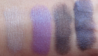
Then we have Black-Eye, darker theme.
This quad has better pigmentation, especially the navy. The white is the most appropriate highlight for my skin tone as it shows a bit of a contrast. The violet is light enough for daytime, and the other 2 shades are dark and sultry.
My first though of this quad is that it is the opposite of Pop-Eye. You can rock it a few different ways for night looks while still can create day looks with a lighter hand to sheer the colour out. Black-Eye won the versatility award in my book.
The colours swatch pretty well. The black seems to be less pigmented than the navy, which might not be a good thing if you want something really dark for the crease. Smoky blue looks would be easier to achieve than smoky black in this case.
Also the white didn't show up very white, to my surprise. It's still good for highlight, but just don't expect it to be a pigmented in-the-face kind of white. Bring your favorite highlight shade along with this quad, if you please.
So the verdict is only 2 practical shades in Black-Eye, the white and black need some more pigmentation to do their job right.
I actually am wearing the purple and navy today for work, one of my favorite looks. They work really well, compliment each other, show up quite matte and blend easily and . I used the white as well, but it didn't show up much under my eyebrows.
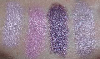
Now this gets better. This is Vivid-Eye, pink theme.
This quad took me by surprise, as it turned out better than I thought. I don't normally wear a lot of pink, as most of the time, it either gets lost in my skin tone or makes me look sick. But I fell in love with 2 shades in this quad the first time I swatched it.
If there anything to improve with Vivid-Eye, it's the light lavender, almost grey shade. I assume I can still use it for all over lids, but I'd love it if it carries a bit more pigmentation.
The highlight looks like a baby pink in the pan, swatched a lightest iridescent pink, almost white. The pink next to it turns out to be a lovely pink too.
If you haven't been able to tell already by the swatches, this quad has the most pigmented shade of all time - the plum. It was really smooth and soft without being powdery, didn't take much to show up on my hand. I am completely sold on this one. LOVE!
Already had some looks planned out with this quad, using the first 3 colours. The last shade could have been lovely too if I didn't have to pack it up for it to show.
This quad would be a winner if it wasn't for this shade, but I still love it for the plum. Annabelle, can I please have this plum colour in a single pan please? Or please make all colours as soft and pigmented as it is. I would love you forever :)
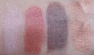
And lastly, Tiger-Eye, bronze theme.
First reaction of mine when I saw the promo pic of all 4 quads: I gotta have this quad. I'm emotionally connected with anything with Tiger in the name. Silly, isn't it?
Another reason I was drawn to this quad is bronze/ brown shades seem to compliment my skin tone very well. They are my "safe" colours.
And do I like it after swatching? Well I do, the same reason I like the other quads - 2 pigmented shades.
The highlight, as expected, was not very visible on me, as it is quite close to my skin tone. The next 2 shades make up for it though, as they are easy to swatch and pigmented. Can't beat the plum above in Vivid-Eye quad, but can build up. The bronze doesn't have anything to write home about, as again it is lacking in the pigmentation department.
This quad would probably is the most appropriate for work as the shades are neutral, but are not very Spring-y.
What do you call the second shade from the left? Reddish bronze, copper? It shows up a bit differently between the lash and non-flash pics, which I found interesting.
So, there you have it, all 4 quads under the "Sparkled Beauty microscope". All pros and cons and stuff :)
To summarize, the quads are created to suit different skin tones and colour preferences.
Can't deny the convenience of quads with pre-coordinated colours to make it easy on you.
Not all of them are winners in my book and there is room for improvements in terms of texture and pigmentation consistency. Some shades are hard and don't swatch well, which mean they won't apply well on the lids.
Some shades, on the other hand, are some of the best Annabelle has made and made top spots in my favorite list: the plum in Vivid-Eye, the copper and darkened brown in Tiger-Eye and the navy in Black-Eye. If the olive in Pop-Eye is a bit more pigmented, I'd love that one too. I'd love to make a Custom quad (or two) out of these colours if Annabelle brings them back in pan form.


The second set is awesome ;)
ReplyDeleteOh interesting, tiger didn't capture my interest at first but I do like the swatches. Anyway lol did u go hunting for these as well?
ReplyDeleteI gave up On them as I couldn't get the dry swatches to work for me.
I usually don't mInd working w foiling but it's hard(slightly annoying) when they all need to be.
But love how the swatches turned up for the pictures :)
Wow, great pics! Very thorough! I don't normally go for purples either, but that's the quad I'm liking the best from your swatches. Do the colours get all mixed up with each other and messy, or do they stay put? That's the problem I have with pans like this.
ReplyDeleteI just got Tiger-Eye I cant wait to give a try. Great swatching.
ReplyDeleteI have been lemming the Tiger qaud myself. Thanks for the swatches and thoughts!
ReplyDeleteLady Flower, you like that one the most? I can't choose, really :)
ReplyDeleteRasilla, it's crazy how swatches could change favorites. Mine certainly did. Thought Pop-Eye was for sure at first. Foiling is not convenient most of the time, I agree
Tracy, thank you :) If you use small brushes and stay within the edges, you should be fine. I don't swirl my brush around, so they don't get messy
Jill, yay another Tiger buy
J, hope you like Tiger :)
Great reviews! I'm definitely not feeling the first quad I think all the colours would just get lost in each other. The other quads look really pretty!
ReplyDeleteElaine, yes the first quad needs some work for pigmentation :)
ReplyDelete